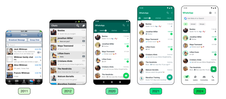
WhatsApp redesigned its user interface, featuring new icons, illustrations, and a deeper dark mode across all users in an attempt to modernize the app.
The messaging app described the refreshed look of the platform as more user-friendly compared to its previous versions.

WhatsApp Refreshes Interface, Retains Core Functionality
WhatsApp is known for its green interface which has become a familiar site for its users. The new layout retains a color palette with the addition of new illustrations and green buttons.
The company shared that the main goal of the new interface is to keep the interface simple despite various additional features that have been added to the app. The modernized look of the app is focused on emphasizing the core functions of WhatsApp.
For Android users, the app introduced a darker mode which features a higher contrast and deeper tones. This will help reduce eye strain and fatigue from using the app in low-light settings. The new feature will also enhance the overall visual appeal and legibility of the texts.
WhatsApp Adds Simplified Navigation for Users
For iOS users, the company simplified the attachment layout by eliminating the full-screen menu and replacing it with an expandable tray. The tray allows users to access media, polls, documents, and more.
In addition, Android users now have a modern look to the native bottom navigation bar. This provides an overview of the functions that are needed quickly. For instance, users can pull the tabs closer to the users' thumbs for better accessibility.
Both Android and iOS users can enable the chat filters which help in organizing and tracing important conversations. It will also increase the focus on more significant messages, instead of scanning through mixed conversation threads.


