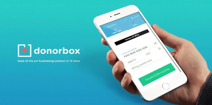
When I say that Donorbox is the best donation app for Wix and Squarespace, I'm not really exaggerating. I've tried a number of them and it really does go above and beyond what most of the other widgets on the market can do. Their fee is relatively reasonable, which makes it attractive for WordPress users as well in spite of the fact that there are just so many options for that platform.
The thing I really liked was that Donorbox does exactly what you need an app like this to do; it accepts donations online and integrates with all of your other tools.
Collecting Donations with a Site Builder
When I first started to work with web design tools, I found that pretty much every small-to-medium sized business and nonprofits I came across used some kind of builder software. They were either stuck with Weebly, Wix, Squarespace or one of around a half dozen other similar pieces of software.
The other thing they had in common was that they wanted out. Please understand, I'm not at all trying to trash them. The problem is, rather, that they don't always set things up properly when you want to collect donations from your users, which is a major issue for pretty much any NPO or NGO that has to run a site.
On the other hand, I was able to find that Donorbox integrates well enough with these platforms that it's more than capable of overcoming many of the drawbacks associated with using them.
Squarespace's built-in donation app only ever allows users to offer a one-time gift. Weebly offers a more sophisticated tool that's really just an integrated eCommerce shopping cart. Once I started to upgrade these platforms with Donorbox plugin, I was able to keep the underlying sites and avoid migration entirely, while greatly enhancing what they could do in terms of online donations. Installation procedures weren't even all that tough either.
Starting Donorbox for the Very First Time
When I first logged into Donorbox, I was instructed to create a campaign. Each campaign, as I soon found out, is a customized donation page or form. Users can create a virtually unlimited number. Campaign-specific donation pages can increase potential donations by a big number.
After you create a campaign, you'll be given a number of options to customize it. However, each field is simply a fill-in-the-blank sort of affair that won't take much effort to get working. That means you can manage multiple campaigns in the same amount of time it would have taken to manage a single one with the default tools that come with most site builders.
Adding a fundraising goal with a progress bar takes only a few clicks, so you won't want to miss out on this and many of the other nice little additions that come with the Donorbox configuration screen.
By using a third party integrations like Double the donations, Donorbox actually lets you double the donor's contribution.
Support from Double the Donation
Have you ever seen those programs where a third-party will boost your donation each time you contribute? Donorbox has partnered with Double the Donation to create a company match function where your donors contribution is matched by their employer.
Considering that there are even a few design features that you can use with a bare minimum of CSS experience, you should be able to customize your donation forms as per your needs and design. Even if you run a custom blog that wasn't built on any of the previously mentioned site builders, you should still be able to integrate the app with very little difficulty.
Whether you're an individual who is trying to raise support for your own site or a representative of a much larger non-profit organization, Donorbox has the tools you need to get the funds you deserve.


