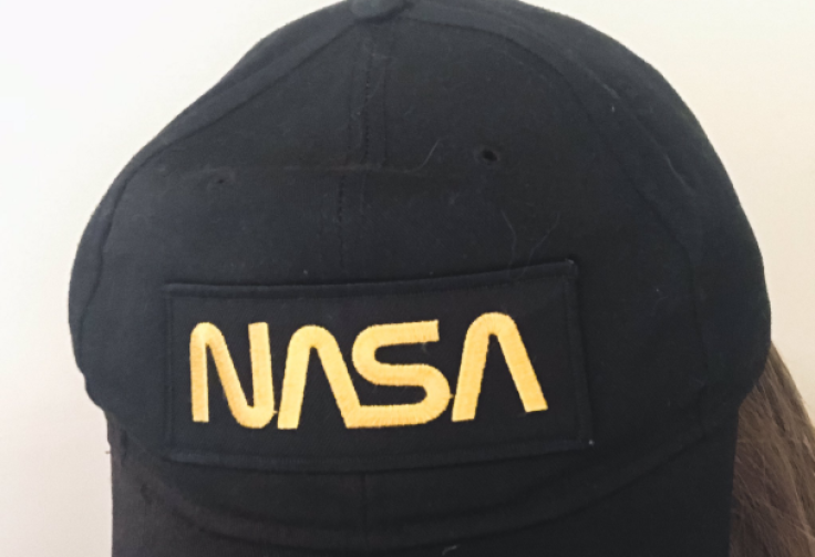
NASA's previous Worm logo has finally been revived to adorn the very side of the new Falcon 9 rocket instead of the popular Meatball. Most fans have probably already seen and know the difference between The Worm and The Meatball logo as you can spot it on merchandise almost everywhere!

NASA's program's typographic logo which is known as "The Worm" will be seen on SpaceX-built rocket known as the Falcon 9 once it sets off for the International Space Station which is scheduled late May despite the logo being officially killed off way back 1992.
The origin of the logo
The logo is also known as the NASA Logotype Insignia, The Worm which was designed by Richard Danne as well as Bruce Blackburn of a specific New York firm called Danne & Blackburn sometime 1975.
The official NASA logotype known as "The Meatball" is the one most popular to the younger generation as it composes of a blue sphere which represents the planet, a red chevron which represents aeronautics, and also white stars which represent a specific orbiting spacecraft that embodies space travel.
This logo was designed by none other than James Modarelli way back in 1959 which was NASA's second year. Modarelli the artist-designer was then an esteemed management services division chief at NASA. He created the logo when the agency called on their employees to submit their own design concepts for consideration.
The different complex elements of the Meatball were details that were hard to reproduce in print across the wide range of other applications which the agency required even including rockets. According to NASA's announcement, "Many people considered it a complicated metaphor in what was considered, then, a modern aerospace era."
NASA's logo upgrades
When The Worm design was born as a specific redesign and upgrade of The Meatball which was prompted by the previous 1972 launch of the National Endowment for the Arts' Federal Design Improvement Program with the goal of improving visual standards across the many government agencies.
Danne & Blackburn's cleaner but also sleeker design had completed the graphic standards manual which aimed to make the agency's logo even more universal as well as versatile. Although The Meatball was not retired during the introduction of The Worm, it seemed to appear in more limited contexts.
The Worm was then relegated to limited appearances on NASA's own merchandises. The decision made to emblazon the Falcon 9 with The Worm launch which aims to carry astronauts to the International Space Station marks a celebrated renaissance of this typographic logo.
According to NASA regarding the redesign's original coals back in 1975, "The retro, modern design of the agency's logo will help capture the excitement of a new, modern era of human spaceflight."
Although NASA has said that it is still deciding on the appropriate use of the logo, the agency has still hinted The Worm's appearance will happen more than one time saying that "There's a good chance you'll see the logo featured in other official ways on this mission and in the future."


