Microsoft has become a household name and a tech giant after it was founded on April 4 of 1975. Since then, Microsoft has gone through changes and its logo has evolved with the times.
Learn more about Microsoft's logo evolution over the years.
Microsoft History
The Microsoft logo design is one of the most famous and most recognized logos around the world. It has been printed on millions of PCs, software boxes, and included in so many websites, per Inkbot Design
Founded by Bill Gates and Paul Allen, Microsoft stood for microporcessors and software, said History. After three years in the business, Microsft's sales topped more than $1 million by the end of 1978. Microsoft licensed its MS-DOS operating system to IBM for its personal computers that debuted in 1981.
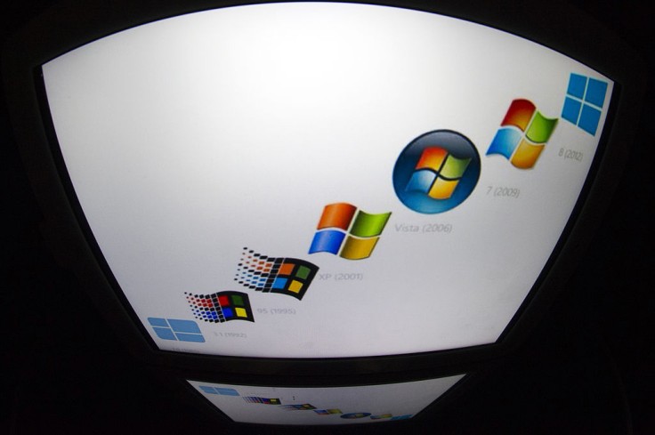
In 1985, Microsoft released a new operating system called Windows and by the late 1980s, it became the world's biggest personal computer software company based on sales. When the Internet took off in the 1990s, the company introduced its web browser called Internet Explorer in 1995--which the company is now retiring with the rollout of their latest Windows 11.
Groovy. Microsoft’s first logo was introduced in 1975. pic.twitter.com/dsPGidN4wP
— Microsoft (@Microsoft) April 5, 2021
Read Also: Windows 11 Insider Preview: 7 Shocking Features NOT Included in Microsoft Update
Microsoft Logo Evolution
Having been in the industry for 46 years, basically being one of the trailblazers of the operating system software, Microsoft has changed its image over the years to fit with the times and its growth. See how the Microsoft logo has evolved through time.
The 1975 Logo
The groovy font was very fitting for that era, with its round edges and concentric lines, said Inkbot Design. The founders themselves created the logo, generated using a programming language. The logo only lasted until 1979.
1980: Bolder and Metal
Microsoft was becoming popular among the new generation of computer programmers and hobbyists.
The company wanted to remain appealing and visually relevant to the newly emerging industry, so they decided to opt for a brand new logo. The logo was influenced by heavy metal bands with its sharp edges, exaggerated stems, and diagonal lines on letters M, R, and F. It honestly looks like it could be the cover title of a rock band's album.
The logo only lasted for two years before the company decided to utilize more classic typography.
Someone made me realize that the second (slash best) Microsoft logo was made using this font! pic.twitter.com/WUciw70x8e
— Marcin Wichary (@mwichary) March 23, 2021
1982: The Blibbet
Using a sold sans-serif font, it looked more timeless and universal. The letter O was "cut" by a series of parallel lines which employees nicknamed "Blibbet." It also served as a standalone logo that was placed on every company stationery.
Alumni and employees alike formed an attachment to the Blibbet and even campaigned to "Save the Blibbet" when a new logo was proposed in 1987.
This was also the period Microsoft launched Microsoft Windows in 1984 as a joint project with IBM. By 1986, the company went public, and overnight, 4 billionaires and 12,000 millionaires were made.
1987: The "Pac Man" Logo
This logo was the longest-running logo of the company. Microsoft Windows had become a household name and rebranding for the new era of computing technology and the company's vision, mission, and goals was an apt move.
Scott Baker, an in-house logo designer, was tasked with the job. He switched out the Blibbet for a slash between the O and the S "to emphasize the "soft" part of the name and convey motion and speed," he said. It looked similar to Pac-Man and was nicknamed as such.
The F and the T met at the crossbar which would be adopted in the next big logo change.
1994: Add a Slogan
Along with the Pac Man logo, the company integrated their slogan somewhere near it.
The logos included "Where do you want to go today?" in 1994, "Your potential. Our Passion" in 2006, and "Be What's Next" in 2011.
As a testament to its classic typeface and functionality, the logo remained as-is for a quarter of a century.
2012: The Window
Microsft launched its new branding on August 23, 2012. A team of in-house designers brainstormed and came up with the colorful logo it is sporting to this day.
It paid homage to the Windows software that sustained the company for nearly 20 years. It took inspiration from product design principles and drew upon the heritage of the company's brand value, fonts and colors.
The F and the T were kept merged like in the previous logo and were made softer with the use of gray for the text. The window emblem logo sported red, green, yellow, and blue intended to express the company's diverse portfolio of products.
Microsoft remains one of the leading tech companies of this age, innovating and growing with the industry as technology changes.
Its logo evolution began as a way to remain visually relevant. As the company became more established, it was able to create a classic logo that stood the test of time. When it was time for a change, it drew inspiration from its heritage, a nod to its beginnings and a wave to its future.


