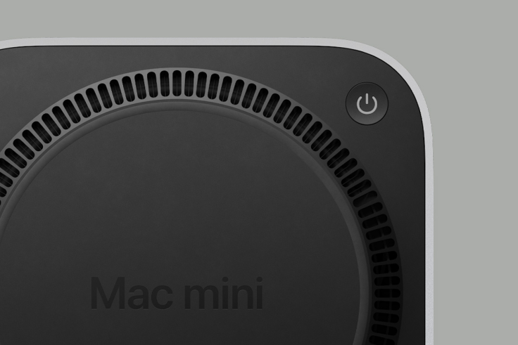
The world celebrated the arrival of the M4 Mac mini as it came with a size revamp that made it smaller, but one of the costs of this redesign is its power button being placed underneath the device, making it difficult for users to turn it on or off. However, Apple has explained its decision to relocate the power button to a more challenging and unpopular spot.
Its recent size reduction is a big deal for Apple and the public who have been anticipating a massive change for the Mac mini, with its latest development not only including an upgraded chip but also changing its form factor significantly.
Apple Explains Why M4 Mac mini's Power Button Is at the Bottom
When Apple introduced the M4 Mac mini earlier this month, users not only noticed its massive upgrade to its most powerful chipset and Apple Intelligence but also the minute design choice of putting the power button underneath the device. Now, in an interview by the Chinese website Bilibili with Cupertino's Greg Joswiak and John Ternus, this design was given the spotlight.
Joswiak and Ternus explained that this relocation of the power button was made because of the Mac mini's redesign, and since the company made it almost half the size of its predecessor, some elements had to be moved.
Because of the device's small form factor, the power button's location was sacrificed, but Apple executives claimed that this was an "appropriate spot" despite users having negative reactions to this.
According to Joswiak and Ternus, users only have to "tuck" their fingers to reach the power button, which is found underneath. Moreover, the executives claimed that Mac's power button is rarely used to turn the computer on.
The M4 Mac mini's Redesign Is a Big-Time Move
Despite the criticism against yet another unpopular design choice for Apple, many reviews and teardowns have praised Apple for the M4 Mac mini's redesign, particularly in the lengths it went to make it significantly smaller.
The M4 Mac mini is almost the size of its Apple TV 4K device, without sacrificing the computer's performance as it can deliver significant power that can match its MacBook Pro and other computers in the market.
Apple's Unpopular Design for Its Tech
Apple may be well known for its minimalist designs of the present, but it still was not safe with its various decisions in the past which have been the subject of poor reviews and online trolling to this day.
One of the most recent subjects of public backlash is the new Magic Mouse because while it upgraded to USB-C charging, the port is still located underneath the device making it unusable when hooked up. It is the same design concept applied to the M4 Mac mini's power button revamp which is not that popular among users, especially since it gives them a hard time using the physical button.
Meanwhile, another device that faced backlash was Apple's iPod Shuffle, particularly its third-generation version which got rid of the control buttons, preventing users from skipping songs or controlling the volume without the EarPods.
There was also the hate on Apple's USB mouse for the iMac G3 which was called the "Hockey Puck"; many users were dismayed with the design choice that had ergonomics flying out the window. In the most recent years, Apple's design improved and was met with praise for its minimalist approach, but despite this, the latest Mac mini's power button reignited this flak against its poor choices.


